

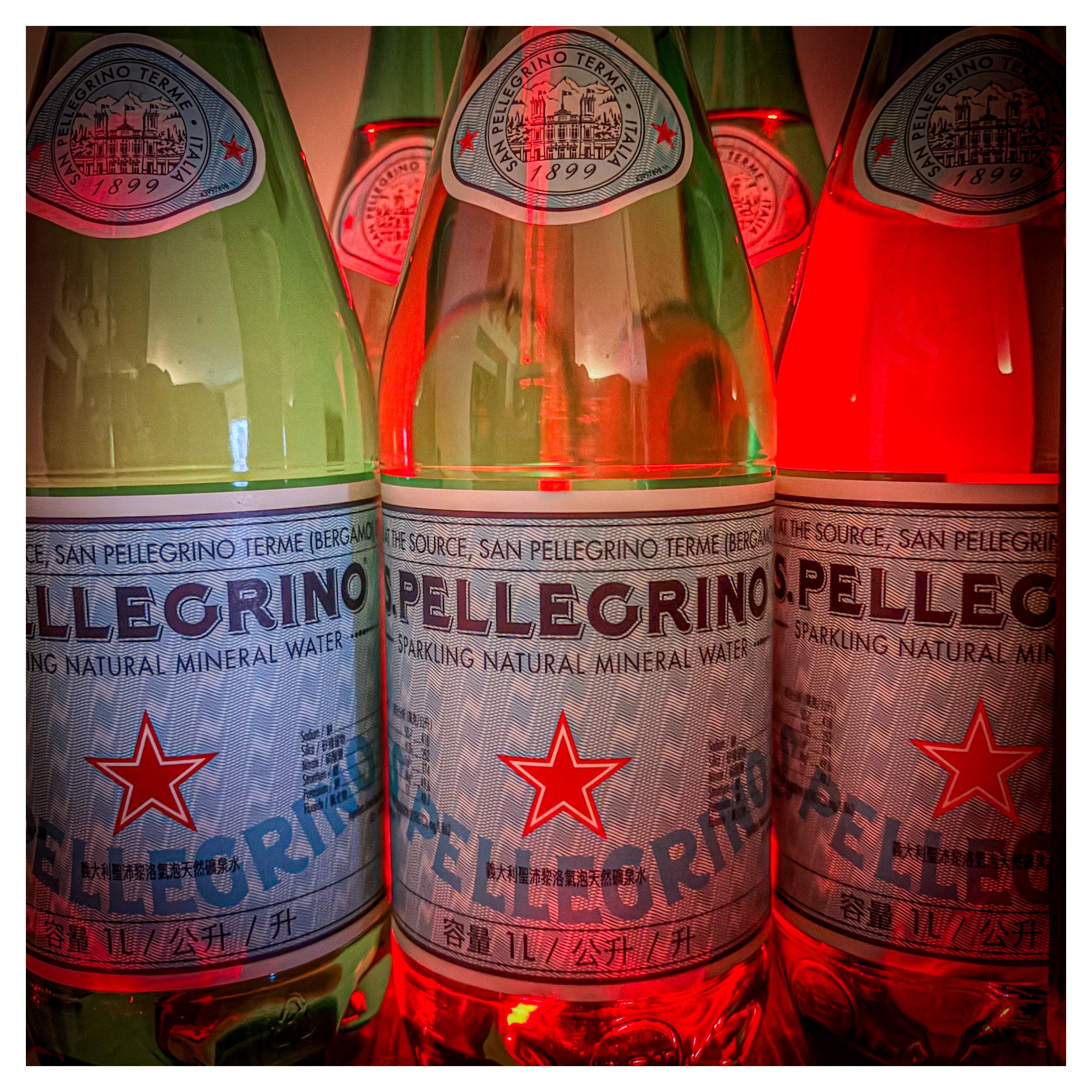
Day 196/365 Lighting the Effervescence: A Study in Crimson and Glass
When ordinary objects meet extraordinary light, the mundane transforms into the cinematic. You will learn why these specific camera settings created such a heavy atmosphere and how color theory can turn a simple bottle of sparkling water into a dramatic, high-contrast masterpiece of light and shadow.
Image Metadata
Camera Model: iPhone 17
Shutter Speed: 1/9
Aperture: f/1.6
ISO: 1000
The Critique: Texture, Tone, and Tension
Your image presents a fascinating intersection between commercial product photography and moody, noir-inspired lighting. By utilizing a strong red backlight, you have transformed the classic green San Pellegrino bottles into silhouettes that hum with energy. The choice of a wide f/1.6 aperture has allowed for a shallow depth of field, keeping our focus squarely on the central label while the background bottles melt into rhythmic shapes.
However, the ISO 1000 on a smartphone sensor has introduced significant noise and grain, particularly in the darker shadows and the red gradients. While grain can sometimes add character, here it slightly muddies the intricate detail of the typography on the labels. The 1/9 shutter speed is also quite slow for handheld work; even with modern stabilization, there is a subtle softness across the frame that suggests a tripod would have yielded a much sharper "bite" on the glass textures.
Pathways to Improvement
To elevate this concept further, consider the following technical and creative shifts:
• Stabilization and Lower ISO: Use a tripod to allow for a longer exposure at a lower ISO (such as ISO 100). This will clean up the digital noise and allow the crisp lines of the labels to pop.
• Color Contrast: While the red is striking, introducing a sliver of a complementary color (like a cool blue or a sharp white rim light) would separate the bottles from the background and define their shoulders more clearly.
• Symmetry and Geometry: Ensure your vertical lines are perfectly straight. In architectural or product photography, a slight tilt can make the viewer feel uneasy. Align the central bottle perfectly with the vertical axis of your frame.
The Long Game: Growing as an Artist
Becoming a master requires more than just pushing a button; it requires an analytical mind. To improve over time, start a Photography Journal. For every shoot, record the "Intent vs. Result." Note why you chose specific lighting and how the data (shutter, aperture, ISO) affected the mood. Over months, you will see patterns in your errors and your successes, allowing you to move from "taking" photos to "making" them.
Research and Study: The Masters
To broaden your visual vocabulary, I recommend exploring these specific artists and resources:
Photographers to Research:
• William Eggleston: The undisputed master of color. Study his "Guide" to see how he makes the mundane look monumental.
• Fan Ho: For his use of light, shadow, and geometric composition in urban environments.
• Saul Leiter: Look at his work for a masterclass in shooting through glass and using "painterly" color palettes.
Essential Reading:
• "The Decisive Moment" by Henri Cartier-Bresson: The bible of timing and geometry.
• "On Photography" by Susan Sontag: To understand the philosophical weight of the images we produce.
Watch and Learn:
• The Art of Photography: William Eggleston – An exploration of how to see color as a subject.
• The Geometry of Composition: Fan Ho – A breakdown of how to lead the eye through a frame.
• Understanding Light and Shadow – A technical guide to dramatic lighting setups.