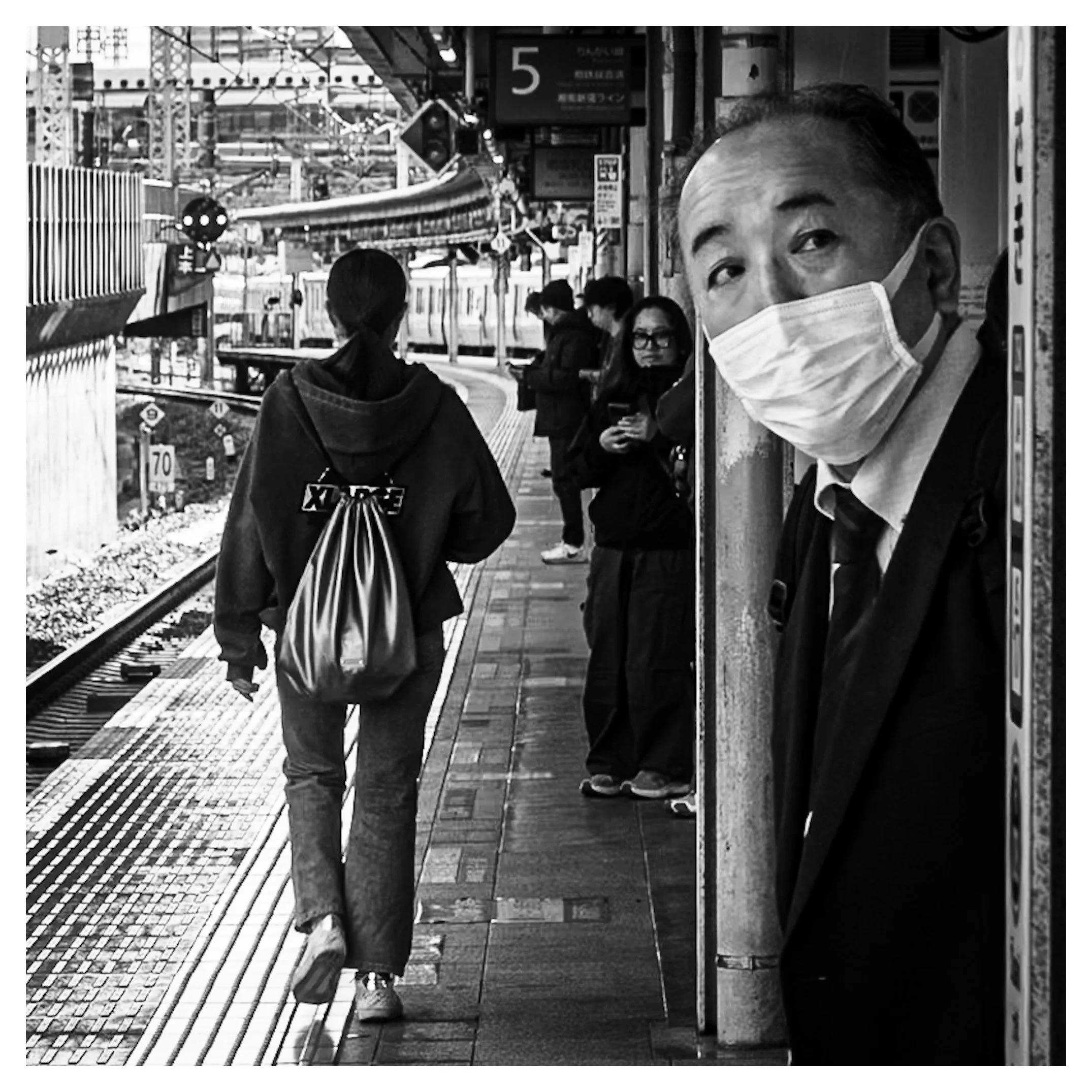
Station Peek
This is a strong piece of street photography that relies heavily on juxtaposition and layering. The image captures a candid moment on a train platform (the signage and environment strongly suggest Japan), utilizing a high-contrast black and white edit to emphasize texture and form.
Here is a critical breakdown of the image's strengths, composition, and areas for potential refinement.
1. Composition and Structure
* Leading Lines & Depth: The composition is anchored by strong leading lines. The tactile paving (yellow blocks in real life, rendered as textured grey here) and the curve of the platform draw the eye from the bottom left deep into the background. This creates excellent depth, moving the viewer from the foreground subject to the mid-ground walker, and finally to the background commuters.
* The Anchor (Foreground): The man on the right acts as a visual anchor. His placement—peeking from behind the pillar/wall—creates a "frame within a frame" effect. He stops the eye from sliding off the right side of the image.
* The "Decisive Moment": The strongest element is the interaction. The subject is looking directly at the lens (and by extension, the viewer). This breaks the "fourth wall" of street photography, turning the image from a passive observation into an active encounter.
2. Narrative and Juxtaposition
* Suit vs. Streetwear: There is a compelling contrast between the two main figures. The foreground subject is an older male in a formal suit and tie, representing the "salaryman" archetype. The mid-ground subject is a younger female figure in loose clothing (hoodie with "XLARGE" logo) and a metallic bag. This juxtaposition highlights the generational and cultural mix typical of urban transit hubs.
* Static vs. Motion: The foreground man is static and confronting the camera, while the mid-ground figure is walking away, oblivious to the photographer. This creates a tension between stillness and movement.
3. Technical Execution
* Black and White Processing: The choice of B&W is effective here. It removes the distraction of the likely chaotic colors of the station ads and clothing, unifying the scene. The contrast is punchy—the blacks in the suit are deep, and the whites in the mask are bright without being totally blown out.
* Focus: The focus is sharp on the primary subject's eyes (the man on the right), which is critical. The depth of field is deep enough that the mid-ground is still legible, providing context.
4. Critique and Areas for Refinement
While the image is successful, here are a few points to consider:
* The "Dead" Space on the Right: The vertical strip of the wall/pillar on the far right occupies about 15-20% of the frame. While it provides context (the texture of the peeling paint is nice), it is visually heavy. A slight crop from the right might emphasize the man's face more without losing the "peeking" effect.
* Background Distractions: The top left corner is quite busy with overhead wires, beams, and high-key (bright) sky. This is often unavoidable in train stations, but the brightness there fights slightly for attention with the man's face.
* The Mid-ground Overlap: The walking woman's head slightly overlaps with the background platform edge and the dark tunnel entrance. Ideally, having her fully silhouetted against the lighter concrete might have created better separation, though this is rarely controllable in candid photography.
Summary
This is a high-quality street photograph. It captures a split-second reaction that feels authentic. The interplay between the observer (the man) and the unaware (the woman), combined with the geometric curve of the station, creates a visually engaging and narratively open-ended scene.
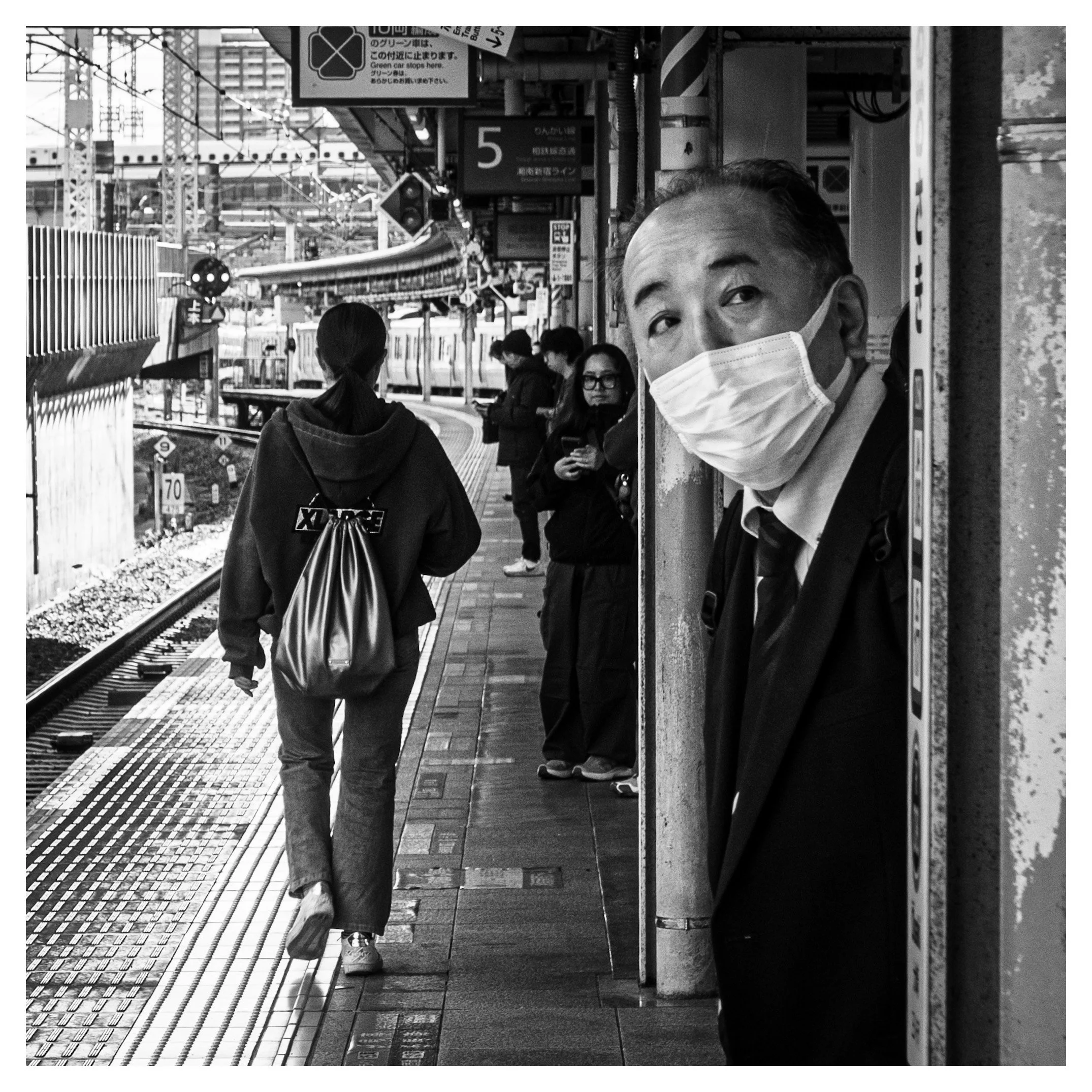
This is a great exercise to see how subtle changes in framing can alter the impact of a photograph.
Based on the critique that the far-right vertical strip of the wall is a bit "heavy" and doesn't add significant narrative value, here is a suggested crop and an explanation of why it works.
The Suggested Crop: "The Right-Side Trim"
The Action:
Imagine slicing off approximately 10% to 15% of the right side of the image. The cut should be made just to the right of the white sticker/sign on the pillar that the man is leaning against.
What stays:
* The entire left side, including the train tracks, the curved platform, and the walking woman (preserving the leading lines and depth).
* The man's entire body and face.
* Just enough of the pillar to show he is "peeking" from behind it.
What goes:
* The thickest part of the textured, peeling wall on the far right edge.
Analysis of the New Crop
Here is how this adjustment changes the emphasis and feel of the image:
1. Increased Intimacy and Impact
By removing the "buffer" space on the right, the man’s face and his direct gaze become significantly more prominent. He is no longer just an element on the edge of the frame; he commands the viewer's attention immediately. The confrontation feels more direct.
2. Improved Compositional Balance (Rule of Thirds)
In the original image, the man's right eye is somewhat centered in the right half of the frame. By cropping the right edge, his eye moves closer to the "power line" (the right-hand vertical third line) of the composition. This generally creates a more dynamic and balanced photographic structure.
3. Removing Distraction
While the texture of the peeling paint on the far right is interesting, it's also bright and busy. In black and white photography, the eye is drawn to areas of high contrast. By removing that busy bright strip, the viewer's eye settles more quickly on the man's face (the intended focal point) and the mid-ground action.
Summary
The original image is a successful environmental portrait. The cropped version becomes a tighter, punchier street photograph where the connection between the subject and the viewer is amplified. Neither is "wrong," but the crop removes the least essential element to strengthen the core subject.