

Day 263/365 Concrete and Light: Reading the Grid in Kaohsiung
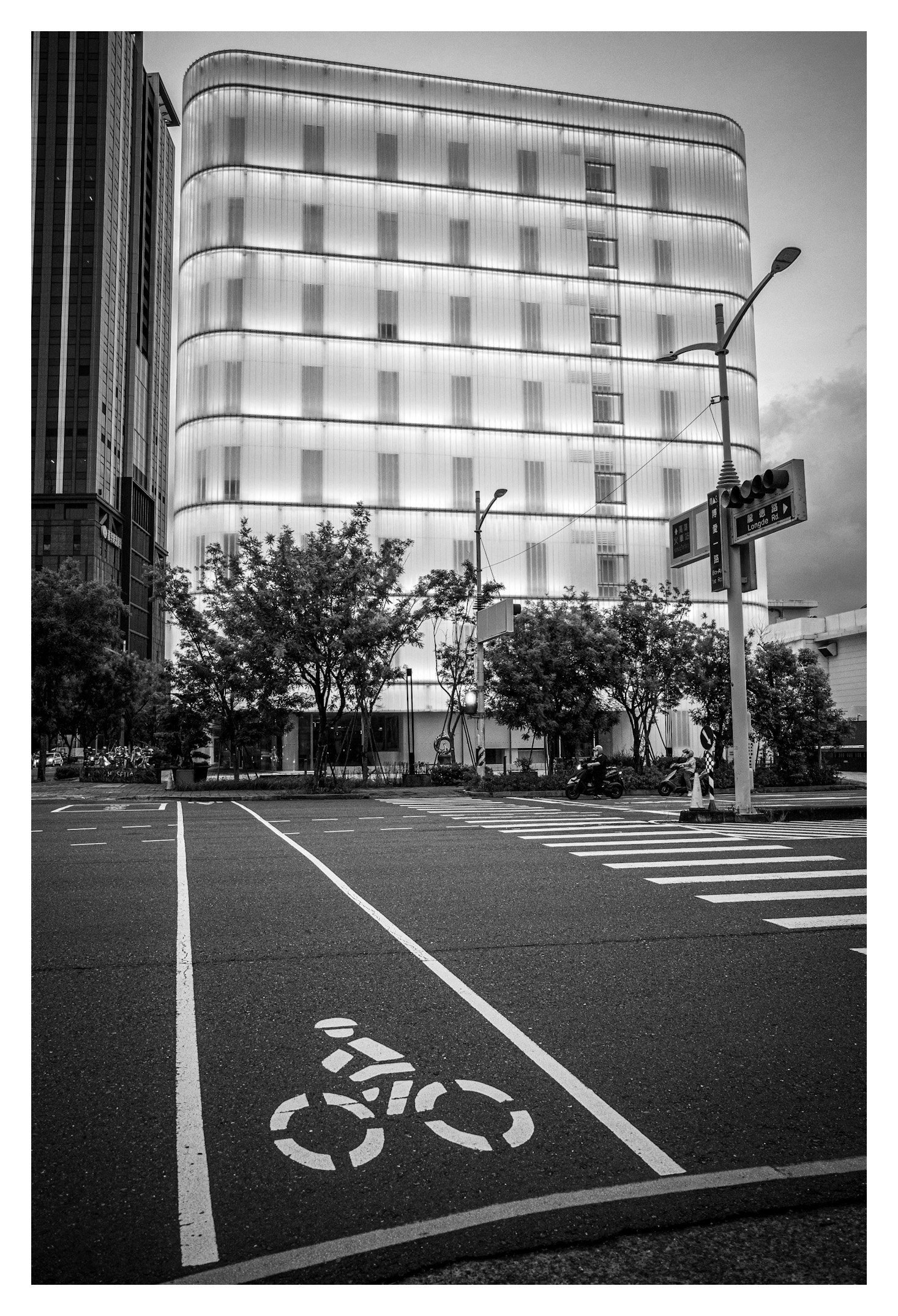
A quiet intersection, a glowing translucent tower, and a bicycle stencil pointing into empty asphalt — this frame from Kaohsiung asks what happens when architecture becomes the only source of light in a photograph. Here’s what’s working, and what a few small adjustments could unlock.
Camera: Ricoh GR
Lens: GR Lens 18.3mm f/2.8 (18mm)
Shutter Speed: 1/125 sec
Aperture: f/4 ISO: 640
The Critique
There’s a lovely tension in this photograph between the monumental and the mundane. The building — that luminous, ribbed monolith — behaves almost like a lantern, its translucent skin doing the work that a sky full of stars might do in a rural night scene. Beneath it, the vocabulary of the street: lane markings, a bicycle stencil, a crosswalk, a traffic pole bristling with signage. This is classic Ricoh GR territory — the lens’s slight wide-angle bite and the camera’s affinity for graphic, high-contrast urban geometry.
The composition leans on a diagonal built from the painted lane lines, which pull the eye from the lower third up toward the building’s base. That’s a strong architectural choice, and the decision to convert to black and white was the correct one — it collapses the scene into pure tonal contrast, letting the glowing building read as a shape rather than getting tangled in whatever color temperature mismatch would exist between its internal lighting and the ambient dusk sky.
Where the image loses some of its potential is in the negative space at the bottom. The bicycle symbol is a strong graphic anchor, but it sits slightly stranded — there’s a lot of dead asphalt between it and the crosswalk that doesn’t quite earn its keep. A touch more compression (a longer focal length, or simply moving closer and cropping tighter in post) would let that stencil carry more visual weight relative to the building, tightening the dialogue between the two.
I’d also gently question the exposure balance on the building’s facade. At 1/125, f/4, ISO 640, you’ve held onto the texture in the glowing panels reasonably well, but a couple of the window sections are pushing toward pure white and losing the vertical rhythm of the mullions. A half-stop less exposure, or a highlight-recovery pass in post, would preserve that sense of a woven, textile-like structure rather than let it blow out into a flat glow.
The two figures on scooters at the right edge of the frame are doing important work — they give the image scale and a sense of inhabited time — but they’re small enough that a viewer’s eye can miss them entirely on a first pass. Worth considering, next time, whether waiting a beat for a pedestrian to enter the crosswalk itself might have given the empty street a more charged sense of anticipation.
How to Improve This Image
Recompose slightly to bring the bicycle stencil and the building into a tighter visual relationship — either physically move closer or crop in post.
Pull back facade highlights half a stop to preserve the vertical banding in the glass.
Consider waiting for a figure to enter the crosswalk for a stronger narrative beat.
A very slight lens correction on the converging verticals at the top of the frame would sharpen the sense of the tower’s mass.
On Becoming a Better Photographer, Over Time
The single most useful habit I can recommend is the boring one: keep a shooting log, even an informal one. Not just settings, but composition decisions — why you chose that vantage point, what you were reacting to. Reviewing a body of work every few months, rather than image by image, is where you actually see your tendencies: are you always shooting wide open? Always centering your subject? Always shooting at dusk? Patterns reveal both your instincts and your blind spots. If you photograph architecture and street scenes often, as this frame suggests, pay particular attention to your handling of scale figures — small human presence in a large built environment is a muscle worth deliberately training.
Study your failures as closely as your successes. A folder of “almost” images — good idea, weak execution — will teach you faster than a folder of favorites.
Photographers to Study
Fan Ho — for architectural light and shadow in Hong Kong street photography; unmatched at finding geometry in urban decay and glow.
Michael Wolf — dense, formal studies of Asian megacities and building facades; essential for anyone drawn to architecture-as-subject.
Rinko Kawauchi — for a completely different register: soft, intimate, color-driven, but instructive on restraint and quietness.
Saul Leiter — color and reflection pioneer, though his black-and-white work is equally worth studying for compositional layering.
Trent Parke — Magnum photographer working in stark black and white, especially strong on light as a subject in its own right.
Books
The Photographer’s Eye by Michael Freeman — still one of the clearest breakdowns of composition and design in photographic terms.
Fan Ho: A Hong Kong Memoir — direct study material for the exact glowing-architecture-at-dusk register this image is working in.
Magnum Streetwise — a broad survey that resists over-indexing on any single photographer’s style.
On Photography by Susan Sontag — less technical, more philosophical, but it will change how you think about what a photograph is doing.
Videos
Sean Tucker, “Why Your Photos Don’t Look Professional” — https://www.youtube.com/watch?v=Vs2yguvj7RI
Peter McKinnon, “7 Photography Composition Tips” — https://www.youtube.com/watch?v=5Fvk1sJa6IU
Mango Street, “Street Photography Tips” series — https://www.youtube.com/@MangoStreetHQ
Kai Wong, “How to Actually Use Manual Mode” — https://www.youtube.com/@kaiwphoto
Keep working this seam between architecture and street. It’s a genuinely difficult mode to shoot well, and this frame shows you’re already asking the right compositional questions — the refinements now are about precision, not instinct.