

Day 326/365 Where The Light Runs Out
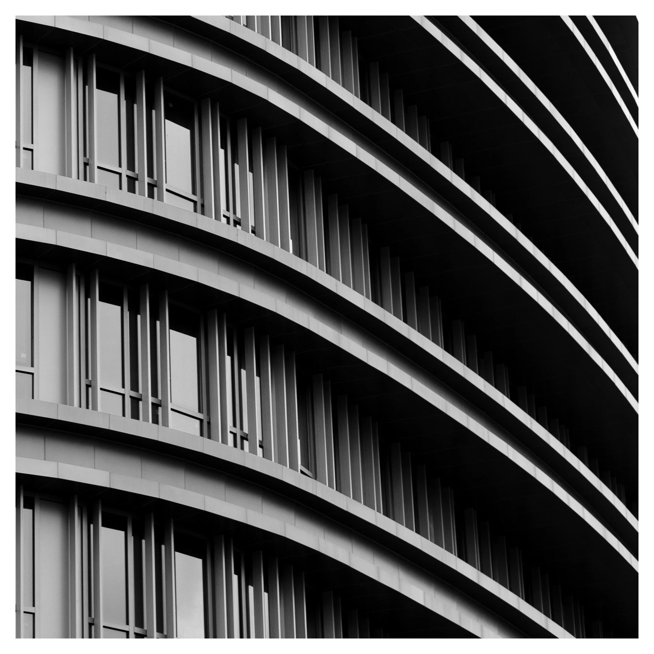
A curved residential tower, photographed close and steeply angled until it stops looking like a building and starts looking like pure rhythm. Repeating balconies curve away into a wedge of solid black. A study in what a photograph is allowed to leave out, and how much structure a frame can carry once everything unnecessary has been erased by shadow.
METADATA
• Camera Model: Fujifilm X-Pro2
• Lens: XF50mmF2 R WR
• Shutter Speed: 1/180 sec
• Aperture: f/3.2
• ISO: 200
THE CRITIQUE
There is a moment in architectural photography when a building stops being a building and becomes a diagram of itself, and this frame sits exactly at that moment. Four or five floors of a curved facade fill the lower two-thirds of the image, each level marked by a projecting balcony band and a screen of close-set vertical louvres, the whole structure curving away from the camera in a long, unbroken arc. Above and to the right, the curve keeps going, but the light does not follow it there. Roughly a third of the frame simply goes black, and a fan of thin, sharply lit diagonal lines cuts across that darkness like the last visible edge of something otherwise swallowed whole.
This is a photograph built entirely on the decision to let information disappear. Nothing about the tower's height, its full extent, its relationship to the street or the sky is shown. What survives is rhythm: the same balcony band repeating floor after floor, each one slightly smaller and higher in contrast than the one below it, giving a real sense of ascent without ever needing a wider shot to prove it. That repetition is doing the work an establishing shot would normally do, and it does it more efficiently, because rhythm read at a glance tells the eye "this continues" far faster than an explanatory wide frame ever could.
The two geometric systems at play here are worth separating out, because they are doing different jobs and only partly agree with each other. The lower structure is curved and horizontal — balcony edges sweeping in long arcs, each one a continuous band of light against the dark voids of the louvred screens behind it. The upper-right passage is straight and radiating — a set of thin, near-parallel diagonal lines fanning outward into the black, almost certainly the underside of a roofline or an upper curve of the same structure catching hard, raking light from an angle the lower floors do not share. Where these two systems meet, at the frame's diagonal spine, the photograph finds its actual subject: not the building, but the specific geometry of how curved and straight light behave differently on the same continuous surface.
Exposure has been handled with real confidence here. Rather than trying to hold detail in both the sunlit balcony bands and the shadowed voids between them, the frame commits fully to the highlights and lets the shadows go essentially to pure black. This is the correct decision for what the image is trying to be. A lifted-shadow version of this same frame, with faint detail visible inside the dark louvred screens and in the upper black wedge, would read as a documentary record of a building. This version reads as something closer to a technical drawing rendered in light — cleaner, more graphic, and considerably more confident about what it is willing to leave out.
There is a lineage worth naming here, distinct from the extreme-angle tradition already discussed elsewhere on this blog. Architectural photographers spent much of the twentieth century developing exactly this discipline: finding the angle, the time of day and the crop that let a building's structure read as pure form, stripped of context, without ever losing the sense that a real, specific, three-dimensional structure produced it. That is a harder balance than either pure abstraction or straightforward documentation, and this frame sits closer to that harder middle ground than its high contrast might first suggest — the louvres are still countable, the balcony curve is still legible as an actual architectural feature, even as the composition pushes hard toward pattern.
The one place the photograph is not fully certain of itself is the radiating diagonal passage in the upper right. It is the most graphically striking element in the frame and also the least explained. A viewer can tell it is architecture, can tell it is catching hard light, and cannot tell with any confidence what part of the building it actually is. That ambiguity is not necessarily a flaw — plenty of strong abstract photographs trade on exactly this kind of productive uncertainty — but it is worth naming as a choice rather than assuming it reads as clearly as the rest of the frame does.
HOW THIS IMAGE COULD BE IMPROVED
• Decide deliberately whether the upper-right diagonal passage should stay ambiguous or become legible. A slightly wider frame, or a companion shot from a different angle showing the same feature in context, would let a viewer resolve what it actually is, if that resolution is wanted.
• Check corner-to-corner sharpness at this aperture. The extreme diagonal means the nearest and furthest points of the facade sit at meaningfully different distances from the lens; a stop or two smaller aperture might hold the vertical louvres crisp across the full sweep rather than only in the closer portion of the frame.
• Consider a version with a sliver of sky, ground, or an adjacent structure included at one edge. The current full abstraction is a strong choice, but a companion frame with a single point of orientation would make an interesting contrast piece alongside it.
• Revisit this facade at a different time of day to see whether the black void can be made to hold any usable texture — a hint of sky tone, a neighbouring building's edge — without sacrificing the graphic punch of the current hard cutoff.
• If a full elevation of this building exists as a separate frame, keep both. A tight abstraction like this one and a fuller documentary view of the same structure are complementary rather than competing, and having both extends what a viewer can learn from the same subject.
ON BECOMING A BETTER PHOTOGRAPHER: LET THE DATA SPEAK
• Track how many of your architectural frames withhold functional context — windows lit from inside, a human figure, a visible ground line — versus how many are fully abstracted into pattern. Knowing which mode you are working in each time sharpens the decision rather than leaving it to instinct alone.
• Log the specific times of day that produce hard-edged, high-contrast shadow on the facades you photograph most often. This kind of image depends entirely on a narrow window of raking light, and knowing that window precisely turns a lucky frame into a repeatable one.
• Note how often you choose an oblique angle on a building's curve versus a straight-on view. Oblique angles compress a structure's full extent into a single frame far more efficiently than a straight view can, and it is worth knowing whether you reach for that compression deliberately or by habit.
• Build a running list of buildings in your city with strong repeating facade rhythms — balconies, louvres, window bays, structural ribs. Revisiting them across different light conditions is the most reliable way to find another frame like this one.
• Compare your fully abstracted architectural work against your street and portrait work for which subjects genuinely benefit from stripping away all context, and which lose meaning without at least one anchor point. Not every building earns the treatment this one received.
PHOTOGRAPHERS TO RESEARCH
• Lucien Hervé — Le Corbusier's official photographer, whose tightly cropped, high-contrast images favoured shadow and mood over a full, explanatory view of any structure.
• Ezra Stoller — the defining American architectural photographer of the mid-century, known for exhaustive patience in waiting for exactly the right light before ever raising the camera.
• Andreas Feininger — trained as an architect before turning to photography, and brought that structural eye to decades of dynamic, high-contrast New York cityscapes.
• Julius Shulman — made mid-century modern architecture legible and desirable to a mass audience through formally rigorous, beautifully lit photographs.
• Werner Mantz — a key figure of the German New Objectivity movement, whose austere, geometric photographs of 1920s modernist housing remain a benchmark for architectural clarity.
BOOKS TO READ
• "Lucien Hervé: Building Images" — a career survey showing how consistently Hervé favoured shadow, crop and mood over full documentation.
• "Ezra Stoller: Photographer" — a comprehensive monograph on the photographer who effectively defined how American modernist architecture was seen.
• "New York in the Forties" — Andreas Feininger. High-contrast, structurally rigorous black-and-white studies of a city at its architectural peak.
• "Julius Shulman: Modernism Rediscovered" — a landmark survey of the photography that made mid-century modern architecture iconic.
• "Werner Mantz: The Perfect Eye" — a recent retrospective of the New Objectivity photographer whose austere geometry still feels remarkably contemporary.
VIDEOS TO WATCH
• Lucien Hervé, Photographer Despite Himself
https://www.youtube.com/watch?v=7cJYDCB-kSA
• Andreas Feininger — BBC Master Photographers (1983)
https://www.youtube.com/watch?v=23UjjfnlDDc
• Visual Acoustics: The Modernism Of Julius Shulman (Trailer)