

Day 361/365 Three Pipes, Three Primaries: A Found Triptych in Red, Yellow and Blue
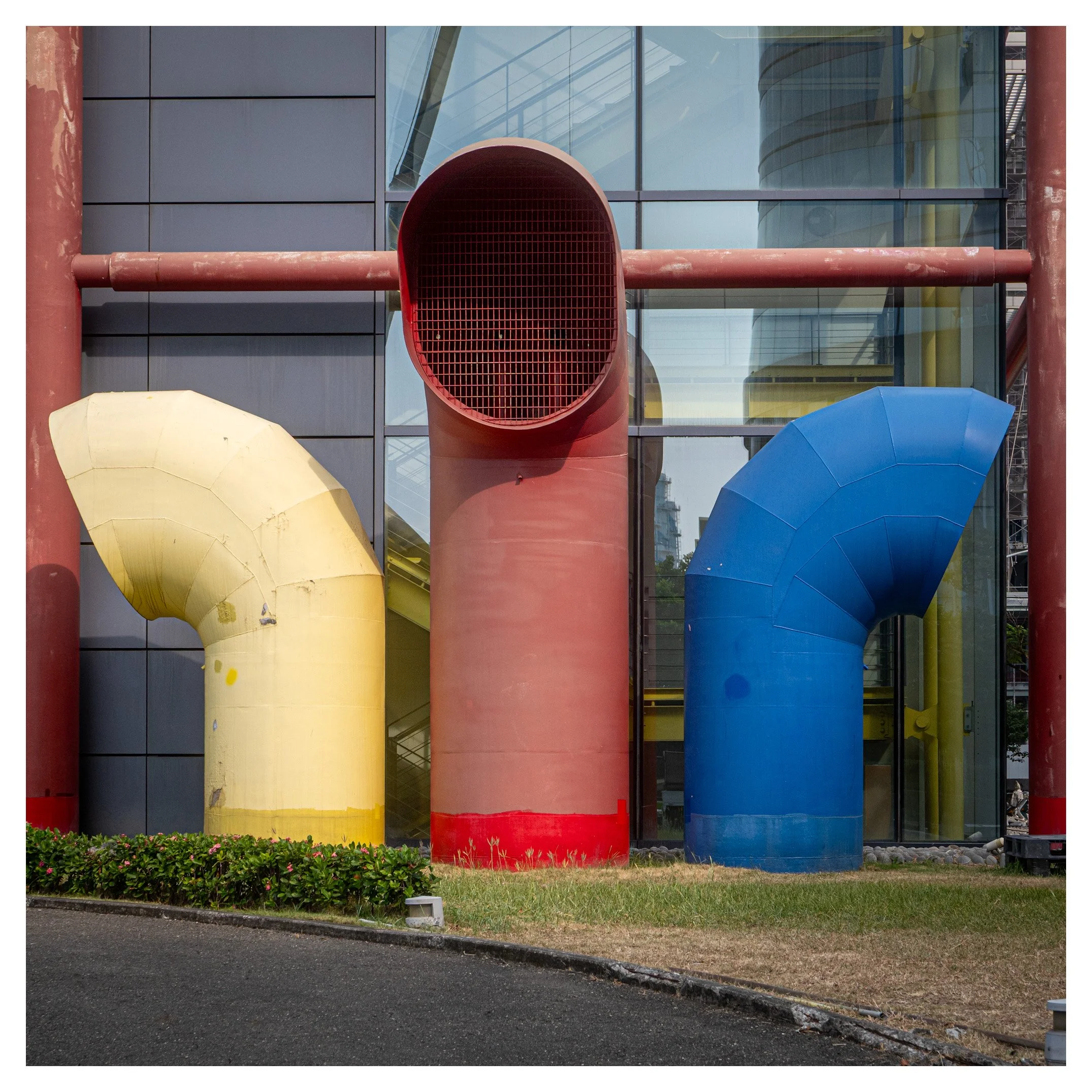
Three giant ducts in yellow, red and blue stand before a glass wall like a sculpture Mondrian might have drawn. Theo Marr looks at why this square frame works, what the foreground gives away, and how to make colour and geometry pull together.
Metadata
Camera Model: Leica D-Lux 8
Shutter Speed: 1/400 sec
Aperture: f/5.6
ISO: 200
Also recorded: d25mm on the DC Vario-Summilux 10.9-34mm f/1.7-2.8 lens, 17 October 2026, 09:12, DNG, 4736 x 3552 original, shown here as a square crop
Critique
This is a picture that earns its title almost by itself. Three enormous duct elbows stand in a row in front of a glass-and-panel wall: a pale yellow one on the left curving away, a red one in the centre whose grilled opening faces us like a round, blank eye, and a blue one on the right curving the other way. Two red posts hold the edges, and a red horizontal beam runs behind the central duct, tying the posts together. It looks like a sculpture, and it was found, not made.
The strengths are clear.
The colour. Yellow, red and blue are the primary colours, and here they are spread across the frame in a balanced row. The deep red of the posts and beam gives the picture a frame, and the pale grey panels on the left give the colours a calm place to sit.
The geometry. The central duct sits on the vertical axis, the beam holds the horizontal, and the two elbows mirror each other like parentheses. The facets on the yellow and blue bends give the curves a stitched, faceted texture that rewards a close look.
The discipline. The verticals are straight, the beam is level, and everything is sharp from the pipes to the glass at f/5.6. The square crop suits the symmetry perfectly.
The character. The scuffs, patches and paint repairs on the ducts, and the bright bands of paint at the base of each one, make these feel like working objects rather than props.
The weaknesses are about the edges, a theme that comes back from earlier posts.
The foreground gives a lot away. The curved asphalt and the grass take up about a quarter of the frame, and the dark wedge at the bottom left is heavy. Small objects intrude along the bottom: a pale light fixture near the centre, another at the right edge, a black crate and a piece of grey equipment cut by the corner. They are small, but they pull the eye out of an otherwise tidy picture.
The glass is busy on the right. The reflections of a curved building and scaffolding sit right next to the blue duct and compete with it. The left side is calm, the right side is not.
The colours are slightly uneven. The central duct reads as a dusty salmon in the hazy light, rather than matching the deeper red of the posts, and the yellow is a pale cream. They are the colours of the objects, but the haze is flattening them.
The light is mid-morning and a little flat. It shows the shapes but does not model them.
Improvement
• Take two steps closer or get lower. A camera at hip height would make the ducts loom and shrink the kerb and grass.
• Check the corners before pressing the shutter. Move a step so the light fixture and the crate drop out, or decide to crop them.
• Come back in lower, warmer light, early or late in the day. Raking light would bring out the facets on the elbows and warm the yellow.
• Process the red a little warmer and richer so the central duct matches the posts.
• Darken the reflections on the right a notch so they do not compete with the blue duct.
• Try f/8 for even sharper corners. 1/400 sec is faster than a still subject needs, so you have room to stop down.
• Shoot a series. Exposed, colour-coded services have a design tradition: the Centre Pompidou in Paris paints its pipes blue for air-conditioning, yellow for electrics, green for water and red for circulation. Look for more examples near you.
Growth and Data
Twenty images in twenty consecutive days.
• Cameras: twelve frames on the Leica D-Lux 8, five on the Ricoh GR III, two on the iPhone 17 and one on the Fujifilm X-Pro2.
• Aperture: eleven frames at f/2.8 or wider and nine between f/3.2 and f/14. This one, at f/5.6, sits in the middle.
• Shutter: from 1/8 to 1/2000 sec. This frame and the ferry frame before it sit at opposite ends of your range, which suggests you are testing both extremes.
• ISO: always between 32 and 640. ISO 200 accounts for ten of twenty frames, half again. The ISO ceiling test above 640 is still owed.
• Crop: nineteen of twenty frames are cropped. Nine are squares, five are 4:5, five are widescreen and one is uncropped.
• Subject: this is your third frame built mainly from geometry rather than people, after Posts 13 and 15.
• Edges: small objects at the frame edge are back as a recurring weakness.
Next steps
• Look for more colour-coded or colour-blocked subjects and shoot them in different light.
• Check all four corners before the shutter, every time.
• Repeat this subject at a different time of day and compare.
• Push the ISO test beyond 640.
• Keep the daily habit going.
Photographers to Study
• Jay Maisel: studied under Josef Albers and became known for finding colour, light and gesture in everyday scenes.
• Pete Turner: a pioneer of saturated colour photography, famous for low angles, geometry and the covers of jazz albums.
• Jan Groover: a painter turned photographer whose colour still lifes of kitchen utensils and plumbing treat ordinary objects as pure form.
• Gerry Johansson: a Swedish master of the square format, who fits nondescript scenes into the frame so exactly that they become beautiful.
• Josef Albers: the German-American artist and teacher whose Interaction of Color shows how one colour changes next to another.
Books to Read
• Light, Gesture, and Color, Jay Maisel
• Pete Turner: Empowered by Color, Pete Turner
• Jan Groover, Photographer: Laboratory of Forms, Tatyana Franck (Scheidegger and Spiess)
• Deutschland, Gerry Johansson (MACK)
• Interaction of Color, Josef Albers
Videos to Watch
• Jay Maisel talking about gesture: https://vimeo.com/116718991
• The Logic and Magic of Color, Josef Albers (Josef and Anni Albers Foundation): https://albersfoundation.org/alberses/teaching/josef-albers/logic-magic-of-color
• Gerry Johansson, the modest photographer portraying our ever-changing surroundings (Arctic Paper): https://www.youtube.com/watch?v=W8HSwl6h1y8
• Jan Groover: An Intimate Portrait (documentary, 18 minutes): https://www.thedarkroomrumour.com/en/film/jan-groover-an-intimate-portrait-a-documentary-film-about-thierry-spitzer-with-bruce-boice-about-the-still-life-and-colour-photography
• Architectural Secrets: The Pipes of the Centre Pompidou (Centre Pompidou): https://www.centrepompidou.fr/en/pompidou-plus/magazine/article/architectural-secrets-the-pipes-of-the-centre-pompidou
Manufacturer Note
For Leica Camera Taiwan and Leica Camera Japan: twelve of the twenty frames in this daily series were made on the D-Lux 8, including this colour study at 25mm, 1/400 sec and f/5.6. A compact that renders three primary colours cleanly, keeps edge-to-edge sharpness on a facetted surface and holds detail in the DNG file is the story I would like to tell with Leica. I would welcome a conversation about a partnership.