

Day 280/365 Behind the Counter: A Study in Grid and Commerce
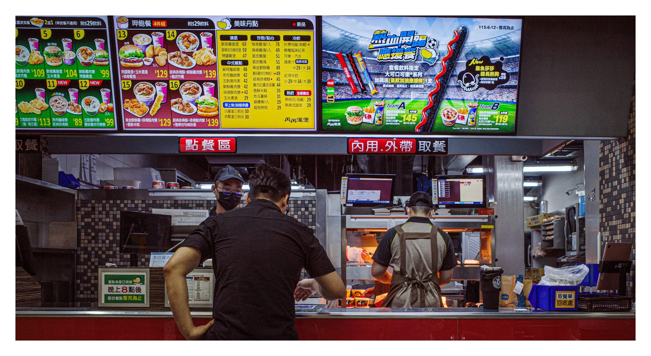
Two fast food workers move through their choreography beneath a wall of glowing menu boards, the whole scene organized into tidy grids of color and information. A study in commercial space, repetition, and the quiet order underneath everyday fast food chaos.
Camera Model: Ricoh GR III
Shutter Speed: 1/160 sec
Aperture: f/3.2
ISO: 200
The Critique
This photograph belongs to a tradition of critical commercial-space photography that runs directly through Andreas Gursky — whose large-scale color photographs result from an incisive look at the effect of capitalism and globalization on contemporary life, concentrating since the 1990s on sites of commerce and tourism. His most famous image in this vein, 99 Cent, depicts the interior of a discount store with numerous aisles of goods, digitally altered to reduce perspective into a flattened grid of color and repetition. This frame achieves something similar through observation alone: the menu boards above the counter form a tight, colorful grid of images and pricing, while the two uniformed workers below move through the practiced choreography of a fast food shift, one facing the counter, one working the register behind him.
The composition’s real strength is its two-tier structure. The upper third is pure information architecture — the illuminated menu screens, their bright reds, yellows, and greens creating a dense visual field that reads almost like a Gursky supermarket aisle, repetition and commerce rendered as pattern. Below that, the human element takes over: two workers, backs mostly to camera, engaged in the practical business of taking and preparing an order. That vertical split between the abstracted commercial signage above and the lived, physical labor below gives the frame a genuine conceptual charge — the gap between how a business presents itself (bright, appetizing, gamified with sports promotions) and the more mundane reality of the people actually running it.
Color is doing serious work throughout. The saturated red, green, and yellow of the menu boards pop hard against the darker, more neutral uniforms and tiled walls below, creating a natural hierarchy that guides the eye from spectacle to substance. There’s also a nice observational detail in the small dual computer monitors mounted mid-frame, glowing screens that echo the larger menu boards above in miniature — a visual rhyme that rewards a slower look.
Where the composition could tighten is in the left edge, where a partial second menu board is cropped awkwardly, feeling incomplete rather than intentionally cut. The frame would benefit from either including that board fully or cropping further right to exclude it, since its current partial state reads as an editing oversight rather than a deliberate compositional choice.
How This Image Could Be Improved
• Resolve the left-edge crop. The partially visible menu board on the far left feels unintentional; either include it fully or trim further to avoid the awkward partial framing.
• Consider a moment with more visible faces. Both workers are seen from behind or in profile with masks; a frame catching an exchange of eye contact between them, or with a customer, could add a second layer of human narrative to complement the strong commercial-space observation already present.
• Watch highlight balance on the screens. The menu boards are bright enough to risk slight clipping in the most saturated reds; a touch of highlight recovery in post could preserve a bit more color texture there.
Becoming a Better Photographer Over Time
• Study commercial and retail interiors as a genre in their own right. Photographers like Gursky treat these spaces with the same formal seriousness as landscape — practice looking at fast food counters, supermarkets, and storefronts for their underlying grid structures and repetition.
• Practice separating “spectacle” and “substance” within a single frame. This image works because it contains both the marketing surface and the human labor underneath it; seek out other environments with that same built-in duality.
• Log your crop decisions against partial elements. Review your archive specifically for frames with an ambiguous, partially cropped element at the edge, and build a habit of resolving that choice deliberately rather than by accident.
Photographers to Study
• Andreas Gursky — the essential reference for this frame’s grid-like commercial interior and critique of consumer space.
• Martin Parr — for his bold, saturated use of color and unflinching portrayal of everyday consumer life, directly relevant to fast food and commercial subject matter.
• Lars Tunbjörk — for his wry, color-driven documentation of workplaces and offices.
• Robert Polidori — for his large-scale, meticulously observed documentation of built and commercial interiors.
• Bernd and Hilla Becher — Gursky’s own teachers, for the underlying typological discipline this image echoes in its grid of menu boards.
Books Worth Reading
• Andreas Gursky (Hayward Gallery / Fundación MAPFRE monograph)
• Common Sense by Martin Parr
• Office by Lars Tunbjörk
• Havana by Robert Polidori
• Bernd and Hilla Becher: Typologies of Industrial Buildings
Videos Worth Watching
• “Andreas Gursky: ‘I Pursue One Goal – The Encyclopaedia of Life’” — direct insight into the artist most relevant to this frame’s composition and concerns.
• “Andreas Gursky - The making of worlds” — further grounding in his approach to commercial and architectural space.
• “The Controversial Photography of Martin Parr” — useful context on color, consumerism, and satire in documentary photography.