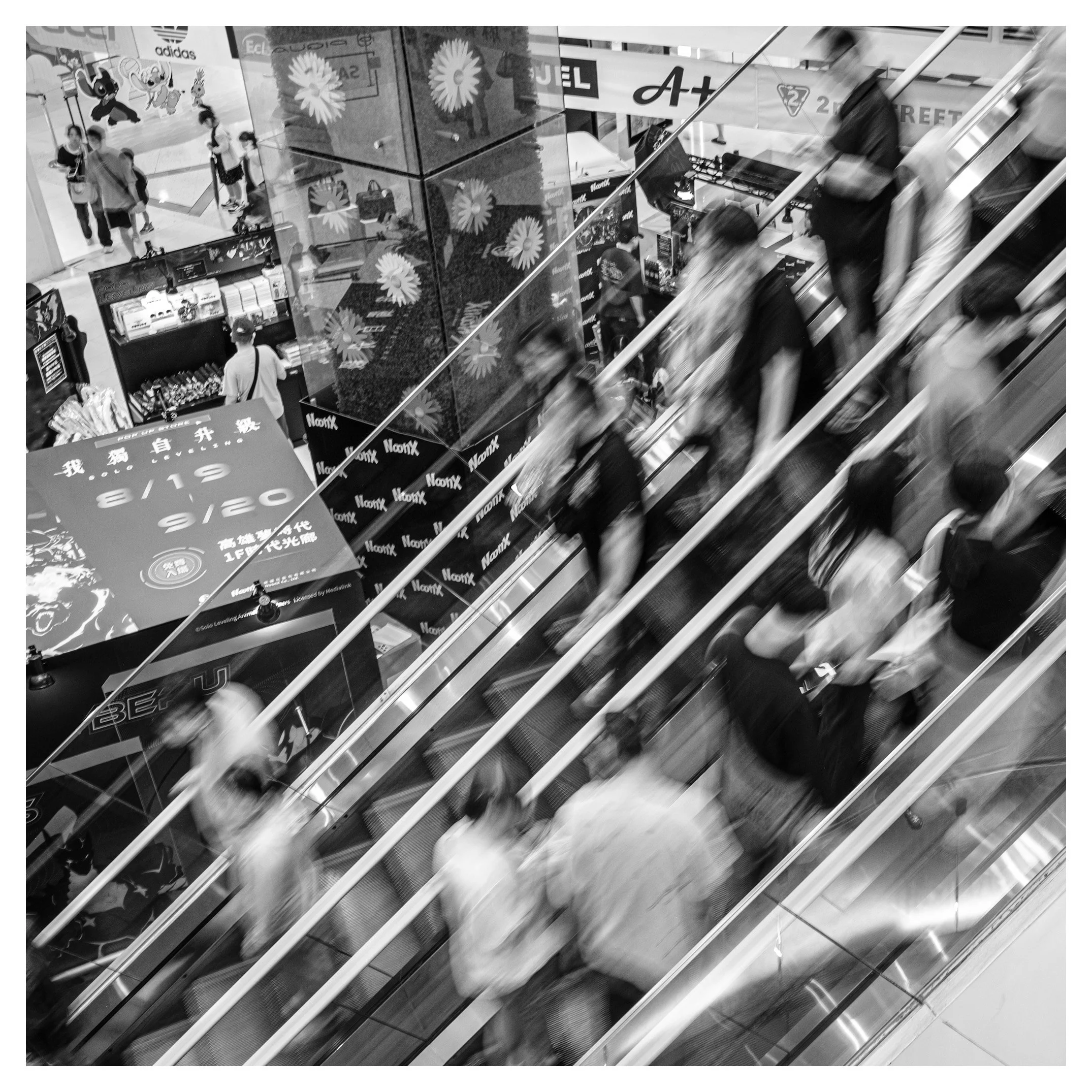
Day 312/365 Rush Hour Ghosts: Diagonals and Dissolve in a Kaohsiung Shopping Mall
A quarter-second exposure turns a crowded escalator bank into a study of motion, geometry, and consumer noise. What happens when you slow the shutter down instead of speeding it up? A look at diagonals, dissolve, and the discipline of shooting deliberately blurred.
METADATA
Camera Model: Fujifilm X-Pro2
Lens: Fujinon XF23mmF2 R WR
Shutter Speed: 1/4 sec
Aperture: f/8
ISO: 200
THE CRITIQUE
Most street photography is a discipline of freezing. This image is a discipline of dissolving, and that distinction is worth sitting with before anything else. At a quarter of a second, the shoppers descending and ascending this escalator bank stop being discrete figures and become something closer to trace elements — smears of presence rather than portraits. It is a considerable technical risk to take handheld in a public space, and it pays off because the photographer understood what needed to stay sharp. The railings, the mirrored pillar, the signage — all the fixed architecture of the frame — hold crisp lines against the blur, which is what keeps this from reading as a mistake and lets it read as an intention. That contrast between the immovable and the dissolving is the entire photograph.
The composition itself is built on aggressive diagonals, three parallel escalator lines slicing the square frame corner to corner, and there's an obvious kinship here with the kind of tilted, kinetic frame William Klein made his signature in 1950s New York — photography that refuses the calm horizontal stability of the classical tradition in favour of something that feels closer to how a crowded space actually feels in the body. But where Klein worked in grain and proximity, this image works in exposure time. The blur does the job that his wide-angle distortion did: it destabilises the viewer just enough to put them inside the rush rather than observing it from a comfortable distance.
There's a second, quieter layer here too, and it's worth naming. The frame is dense with consumer signage — sportswear branding, an anime pop-up store, a mirrored column throwing back a floral graphic, a black backdrop wallpapered in a repeating logo. This is not empty architecture; it's a saturated commercial environment, and the image doesn't editorialise about that saturation so much as simply refuse to look away from it. That density of branded information within a single frame recalls the forensic attention Martin Parr pays to consumer culture, though rendered here in monochrome and motion rather than Parr's characteristic saturated color and stillness — an interesting inversion of his method that still arrives at a related observation about how thoroughly commerce fills modern public space.
The mirrored pillar deserves particular credit. It doubles the frame's information without adding real depth, folding the floral graphic back into the composition and creating a secondary read for anyone who lingers on the image past the first glance — a device with a clear lineage back to photographers like Lee Friedlander, who spent much of his career using reflective surfaces to complicate what should be simple space.
IMPROVEMENT SUGGESTIONS
• Some of the figures nearest the top of the frame have blurred past the point of reading as human gesture and closer to pure abstraction. This works for the image as a whole, but a second frame at something like 1/8 or 1/15 second would have offered a comparison point with slightly more legible motion, worth shooting as a bracket next time rather than committing to one exposure.
• The upper left corner, with its static shoppers and layered signage, is visually calm relative to the diagonal energy below it, and it currently sits in an uncertain middle ground — not busy enough to serve as strong counterpoint, not quiet enough to function as a clean rest area for the eye. A tighter crop excluding more of that corner, or conversely a deliberate exposure choice to bring more life into it, would resolve that tension.
• The square crop is a bold choice and suits the interlocking diagonals well, but it's worth reviewing the original 3:2 frame before committing — a square crop applied as a default habit rather than a considered decision can quietly cost an image information at the edges that a wider aspect ratio would have kept.
• Given how well the static elements held sharp at 1/4 second, it's worth identifying whatever brace point was used — a railing, a wall, a lens against a pillar — and treating it as a repeatable technique rather than a one-off. Slow shutter street work lives or dies on that kind of improvised stability.
BUILDING A BETTER EYE OVER TIME
Improvement in photography is rarely a single leap. It's compiled, image by image, the way sediment builds a shoreline. A few disciplines worth adopting:
• Keep a running log of your EXIF choices against outcomes. Note which apertures and shutter speeds you gravitate toward in different light, and which ones actually served the image versus which were reflexive habit. Patterns will surface that tell you where your instincts are strong and where they're merely comfortable.
• Review contact sheets, not just favourites. The images you almost chose are often more instructive than the ones you did — they reveal the decision points where your eye was calibrating.
• Track a "keeper rate" over months, not days. A rising ratio of publishable frames to total frames shot is one of the few honest metrics of growth in this medium.
• Study one photographer intensively per month rather than skimming many. Depth of study builds vocabulary faster than breadth.
• Seek out critique from people who will disagree with you. Comfortable feedback flatters; honest feedback sharpens.
PHOTOGRAPHERS TO STUDY
• William Klein — for his embrace of blur, tilt, and proximity as tools of energy rather than flaws to correct.
• Martin Parr — for his forensic, almost anthropological attention to consumer culture and the density of branded information in public space.
• Lee Friedlander — for his sustained use of reflections and glass to complicate and layer ordinary urban space.
• Shomei Tomatsu — for his postwar Japanese eye on consumerism, Americanisation, and the collision of tradition with commercial modernity, a useful cultural counterpoint given the anime and sportswear signage in this frame.
BOOKS TO READ
• "Life Is Good & Good For You in New York" by William Klein
• "The Last Resort" by Martin Parr
• "America by Car" by Lee Friedlander
• "Chewing Gum and Chocolate" by Shomei Tomatsu
VIDEOS TO WATCH
William Klein: The Maverick Who Transformed Photography — a look at how Klein broke the rules of stability and distance that defined photography before him, directly relevant to the risk this image takes with blur.
https://www.youtube.com/watch?v=VlFmC1k9UP8
Slow Shutter Street Photography: Capturing Motion Blur — a practical walkthrough of the exact technique at work in this frame, useful for refining exposure choices on future attempts.
https://www.youtube.com/watch?v=nz-yEaYEYWk
Using Geometry in Street Photography — a breakdown of how lines, shapes, and diagonals structure a frame, directly applicable to the escalator composition here.