

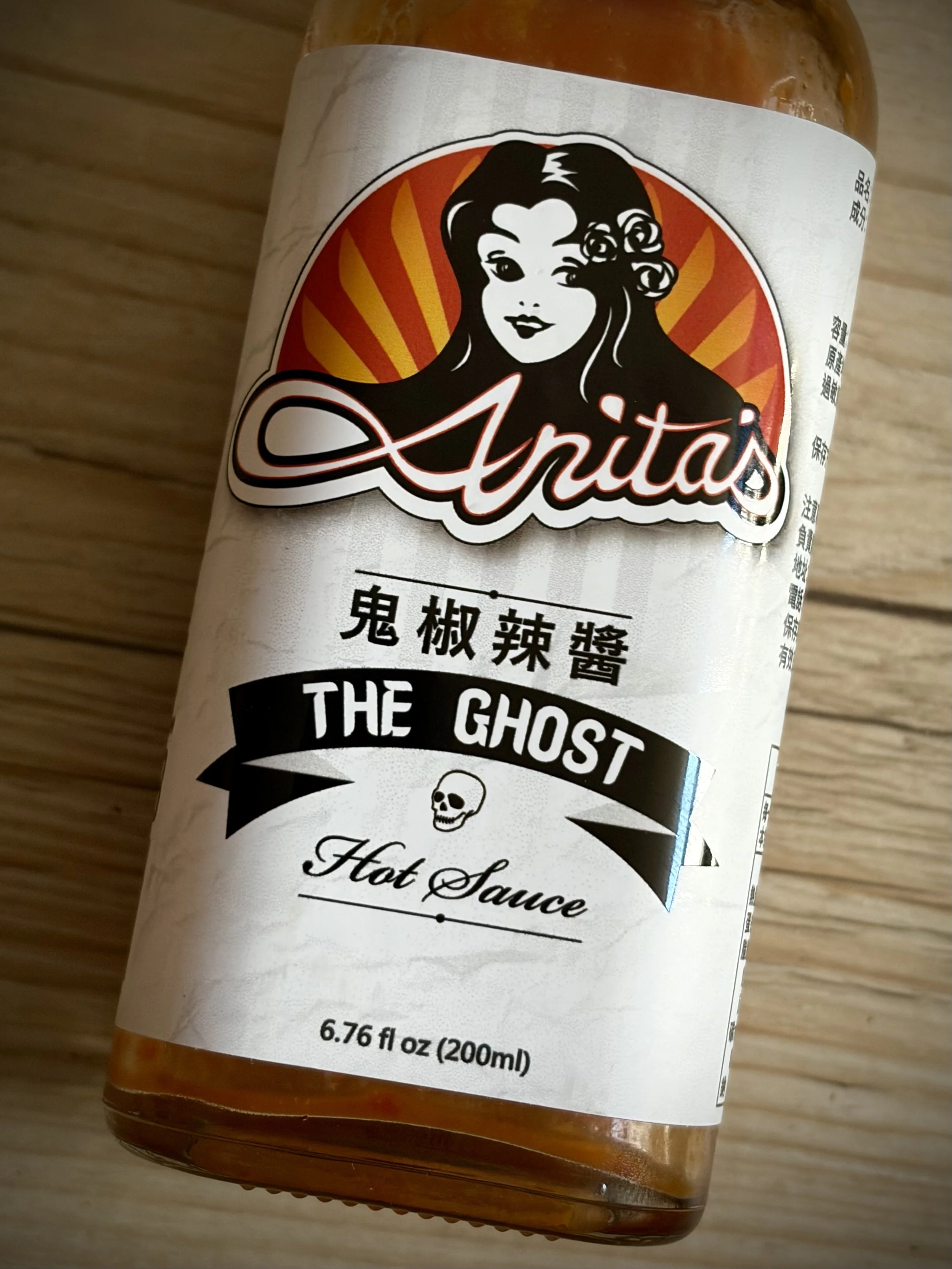
A small-batch hot sauce label turns out to be doing three different jobs at once: selling personality, selling heat, and quietly satisfying an import regulation. A close look at what happens when American rockabilly branding, a skull icon and government-mandated Chinese text all have to share the same six centimetres of glass.
METADATA
• Camera Model: Apple iPhone 17
• Shutter Speed: 1/40 sec
• Aperture: f/1.6
• ISO: 200
THE CRITIQUE
A photograph does not need a dramatic subject to reward close looking, and a hot sauce bottle on a wooden table is about as undramatic as a subject gets. What makes this one worth five minutes is not the composition, which is modest, but the object itself: a small piece of graphic design carrying more information, and more contradiction, than its size would suggest.
Start with the layout. The bottle sits on a diagonal, cutting roughly corner to corner across the frame rather than standing upright, which keeps the image from reading as a flat catalogue shot even though nothing else about the presentation is particularly considered. It is a small decision, but it is doing real work: an upright bottle against a plain background is inert in a way a tilted one simply is not.
The label itself is where the actual interest lives, and it is worth reading the way a designer would rather than the way a shopper would. Three distinct typographic voices are stacked on top of each other, each selling something different. At the top, a swash script logotype reading Anita's, rendered in the visual language of vintage tattoo flash and mid-century hot-rod culture, complete with a winking pin-up illustration inside a sunburst roundel. This is the personality layer, the part of the label whose entire job is to make the brand feel handmade and a little bit outlaw. Below it, in a heavy black banner with a skull icon, THE GHOST, in bold sans serif, doing the second job: signalling heat and danger, cashing in on the actual ghost pepper the sauce is named for. Beneath that again, a soft cursive Hot Sauce, which walks the aggression of the skull back toward something more traditional and approachable. Three registers, three different emotional pitches, occupying perhaps four vertical centimetres of label.
Then there is the bilingual split, which is the most interesting thing on the bottle and the thing most likely to be walked past without a second look. The English branding is all voice and personality. The Chinese text beneath it — 鬼椒辣醬, ghost pepper hot sauce — is set in a plain, serious serif with none of the illustrated flourish above it. It is not translating the brand's personality into Chinese. It is simply stating what the product is. That asymmetry tells you plainly which language this label considers its audience for charm, and which language it considers its audience for information, and it is a genuinely useful thing to notice next time any imported product crosses your path.
Partially visible at the frame's right edge, cropped by the angle of the shot, is a third register entirely: small grey Chinese text in a plain government-mandated format, almost certainly volume, origin and importer information required by Taiwanese labelling law. This is the least glamorous text on the bottle and the most legally necessary, sitting in direct, slightly comic proximity to a winking cartoon woman and a skull. A hot sauce label, it turns out, is a small case study in how many different jobs a single piece of packaging is required to do at once: seduce, inform, warn, and comply, frequently within inches of each other.
Technically, this was made at what the phone reports as 52mm equivalent — its 2x sensor crop rather than a physical telephoto lens — at f/1.6, close enough to fill the frame with the label without needing to get uncomfortably near the glass. That combination keeps a reasonable working distance while still producing enough separation to let the wood grain behind soften slightly at the edges, and the warm amber liquid visible at the bottle's base picks up a faint echo of the label's own orange sunburst, which is a pleasant, unplanned bit of colour agreement between subject and packaging.
None of this amounts to a striking photograph. It amounts to a competent, close, patient look at a piece of consumer design that most people would glance at for two seconds while shopping for hot sauce. That is, on reflection, exactly the point.
HOW THIS IMAGE COULD BE IMPROVED
• Commit to the diagonal more fully, or abandon it. The current tilt is moderate enough that it reads as slightly accidental rather than as a deliberate compositional choice; a steeper angle would feel more intentional, and a fully levelled frame would feel more like a clean design record. The middle ground currently occupied does neither job completely.
• Capture the label flat and uncurved at least once. Photographed on a cylindrical bottle, the roundel and type are subject to a slight radial warp that a straight-on, perpendicular frame — or simply peeling the label to photograph it flat — would remove entirely, which matters here because the design itself, not the bottle, is the actual subject of interest.
• Get the whole label in frame. The top of the roundel and the very bottom of the volume text both sit close to the frame edges; a small step back would let the complete design breathe rather than crowding its boundaries.
• Check the bottle's glass for smudges or fingerprints before shooting. At this proximity and this aperture, any surface marks on the glass itself become part of the image whether intended or not.
• Vary the surface. This is now several posts in this series that have used a plain wooden table or floor as a backdrop; worth checking whether that has become a genuine default rather than a considered choice for each subject.
ON BECOMING A BETTER PHOTOGRAPHER: LET THE DATA SPEAK
• Keep a running note of backgrounds used across your casual, non-location shots — wood tables, floors, countertops. A recurring default is fine, but knowing it exists means you can choose to break from it deliberately rather than by accident.
• When photographing anything with typography or graphic design as its actual subject, make at least one frame perpendicular to the surface, free of any curvature or angle distortion, before making any more stylised version. The design needs to be legible before it can be interpreted.
• Start a private reference folder of package and label design that catches your eye — hot sauce, tea, night-market snack packaging. You clearly already notice this kind of layered typography; giving it a dedicated home will sharpen that eye faster than noticing it only in passing.
• Audit how often you reach for a diagonal composition in casual object photography specifically, separately from your street and portrait work. A habit that serves one genre well can go unquestioned in another where it may not be earning its place.
• Practice separating two different questions when reviewing a frame like this one: is the object well designed, and is the photograph of it well made. They are easy to conflate, and conflating them can make a mediocre photograph of a genuinely interesting object feel more successful than it is, or the reverse.
PHOTOGRAPHERS TO RESEARCH
• Josef Sudek — decades spent finding extraordinary depth in ordinary glass, light and household objects photographed from a single studio window.
• William Eggleston — elevated the offhand, everyday American object to serious subject matter, and proved a snapshot aesthetic could carry real weight.
• Paul Outerbridge — an early master of turning commercial still life, including bottles and household products, into rigorous, almost abstract composition.
• Guido Mocafico — a contemporary specialist in meticulous still-life photography of bottles, glassware and manufactured objects, treating product photography as a genuine art form.
• Roe Ethridge — moves fluidly between commercial and fine-art photography, often photographing the exact kind of consumer object this label belongs to with a critical, layered eye.
BOOKS TO READ
• "The Window of My Studio" — Josef Sudek. Glass, light and household objects photographed with a patience that rewards very close looking.
• "William Eggleston's Guide" — William Eggleston. The book that argued the everyday American object was worth photographing seriously in the first place.
• "Paul Outerbridge: Command Performance" — a career-spanning survey including his pioneering still-life and commercial product photography.
• "Stilleven" — Guido Mocafico. Contemporary still life at its most exacting, glassware and manufactured objects rendered with near-scientific precision.
• "American Polychronic" — Roe Ethridge. A career survey moving between commercial and personal photography, product and portrait treated with the same critical eye.
VIDEOS TO WATCH
• Josef Sudek — A Photographer Who Devoted His Life To Beauty
https://www.youtube.com/watch?v=oe5p3n65R7M
• William Eggleston: Democratic Camera — Candid Interview With Michael Almereyda