

Day 36/365 The Vertical Gaze: Finding Geometry in the Chaos of Kaohsiung
A Critique by Theo Marr
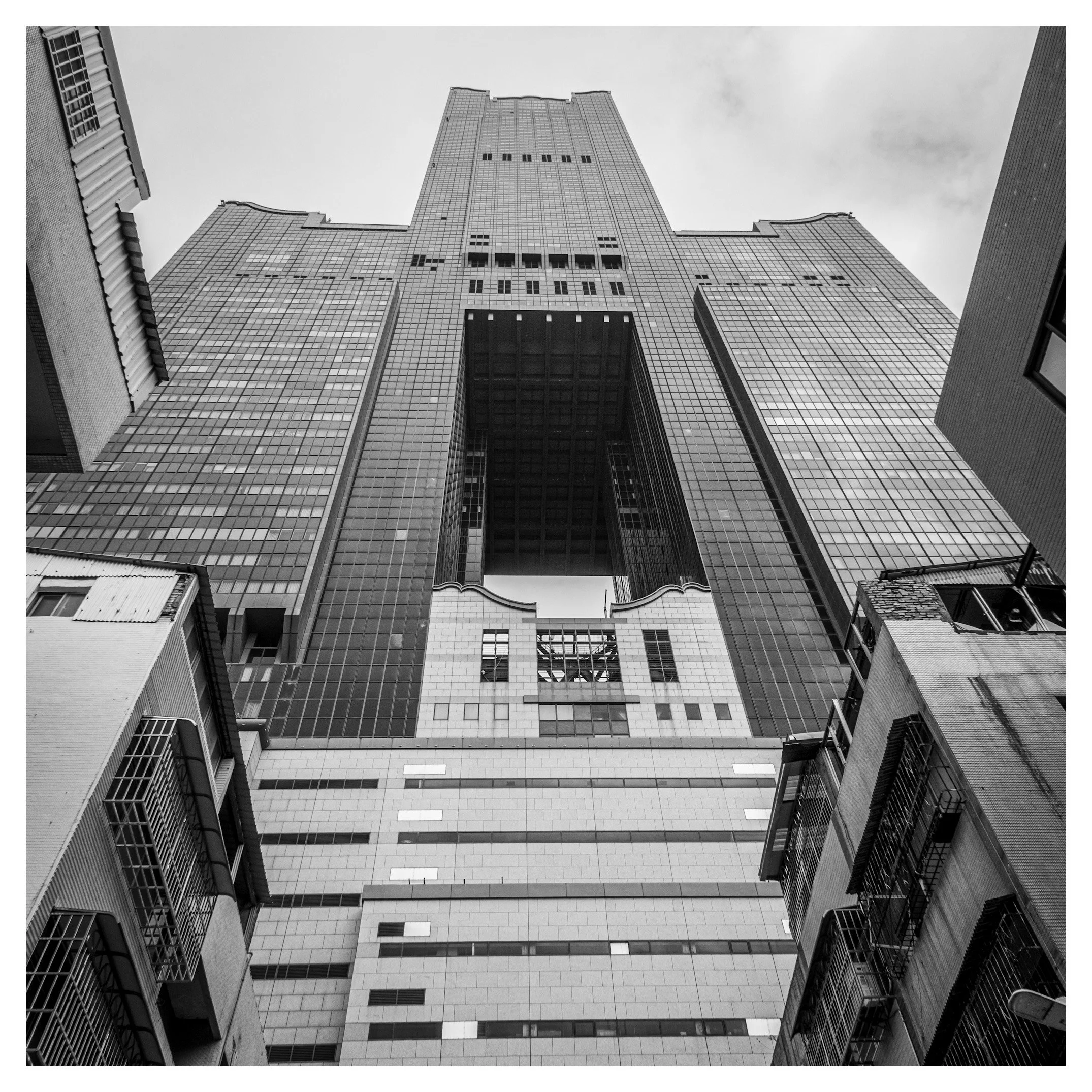
There is a distinct "visual weight" to Kaohsiung—a city where the humidity seems to cling to the concrete, and the architecture fights for breathing room. Your photograph of the 85 Sky Tower captures this perfectly. You haven't just photographed a building; you have photographed a relationship.
The Analysis
You have chosen a "worm's-eye view," a classic perspective for conveying scale. By placing the viewer at the bottom of the urban canyon, looking up through the "V" of the older residential blocks, you force us to feel small. The choice of black and white is excellent here; it strips away the distraction of rusted corrugated iron and faded paint, reducing the scene to pure geometry and texture. The "cage" windows of the foreground buildings act as a gritty texture that contrasts beautifully with the sleek, grid-like facade of the skyscraper.
The Advice: Intentionality in Symmetry
However, there is a tension in this image that feels unresolved. You have set up a symmetrical shot—the tower is centered, and the foreground buildings frame it on both sides. Yet, the camera position is slightly to the left.
In architectural photography, you must be a surgeon. If you are going for symmetry, it must be absolute. A millimeter off, and the viewer’s eye will subconsciously try to "fix" the image.
* Correction: Next time, find the exact center point. If the environment prevents this (a wall, a road), then abandon symmetry entirely. Go oblique. Commit to the angle. "Almost symmetrical" reads as a mistake; "deliberately asymmetrical" reads as art.
The Advice: Managing the Highlights
Your sky is a flat, uniform grey. In monochrome, the sky is your negative space—it needs to work harder.
* Correction: When shooting, underexpose slightly to protect the highlights in the clouds. In post-production (or using in-camera filters), apply a Red Filter simulation. This will darken the blue sky and make those white clouds pop, adding drama to the background and separating the tower from the ether.
The Data Strategy: Becoming Your Own Case Study
You asked how to improve over time. The answer lies not just in shooting, but in auditing. You need to treat your photography metadata as a diary of your artistic evolution.
I want you to build a spreadsheet (similar to the one you provided for your books) for your "Keeper" images—the top 1% of what you shoot. Track these metrics:
* Focal Length: Are you constantly shooting wide (24mm) or tight (85mm)?
* Aperture: Do you default to f/8, or are you wide open?
* Light Quality: Hard sun, overcast, golden hour, neon?
* The "Why": A single keyword on why you liked it (e.g., "Texture," "Isolation," "Geometry").
Why do this? After 50 images, you will see a pattern. You might realize, "I produce my best work in high-contrast light with a 35mm lens." Once you know your strengths, you can lean into them—or deliberately force yourself to shoot the opposite to grow.
Curated Recommendations for Study
Based on your image and your existing library, here is a prescribed curriculum. These artists mastered the verticality, density, and monochrome grit you are exploring.
1. The Master of Composition: Fan Ho
Your database lists Portrait of Hong Kong, and this is essential reading. Fan Ho was the master of the "frame within a frame." He didn't just document Hong Kong; he arranged it. Study him to learn how to use light shafts and shadows to hide the "messy" parts of a city and highlight the structure.
* Read: The Living Theatre by Fan Ho (if you can find it) or Portrait of Hong Kong.
* Watch: "Fan Ho | The Art of Light, Shadow, and Humanism"
* This documentary explores how he applied rigorous composition to chaotic street scenes.
* Watch Video Here
2. The Architect of Density: Michael Wolf
You are photographing vertical density. No one did this better than Michael Wolf. His Tokyo Compression is listed in your file, but for this specific style, look at his Architecture of Density series. He strips away the sky and ground, leaving only the repetitive patterns of the buildings—a technique you are close to achieving here.
* Read: Architecture of Density (referenced in your Tokyo Compression entry context).
* Watch: "Michael Wolf on Hong Kong's Architecture of Density"
* Wolf explains his concept of "no escape" in the image frame, which is very relevant to your tight framing of the 85 Sky Tower.
* Watch Video Here
3. The Street Grittiness: Daido Moriyama
The foreground of your image—the burglar bars, the worn concrete—is pure Moriyama. He embraces the are-bure-boke (grainy, blurry, out-of-focus) aesthetic. While your shot is sharp, studying Moriyama will teach you how to photograph the "ugly" parts of the city with affection and aggression.
* Read: Farewell Photography or Labyrinth.
* Watch: "Daido Moriyama: The Photographer Who Didn't Look Through the Viewfinder"
* A look at how he captures the raw energy of the street, often without even looking at the camera.
* Watch Video Here
My Next Step for You:
Would you like me to analyze the metadata of this specific image (if you can provide the EXIF data) and start the first row of your "Growth Spreadsheet" for you?