

Day 79/365 Concrete Waves & Shadow Play: Finding the Curve in the Concrete
EXIF Data
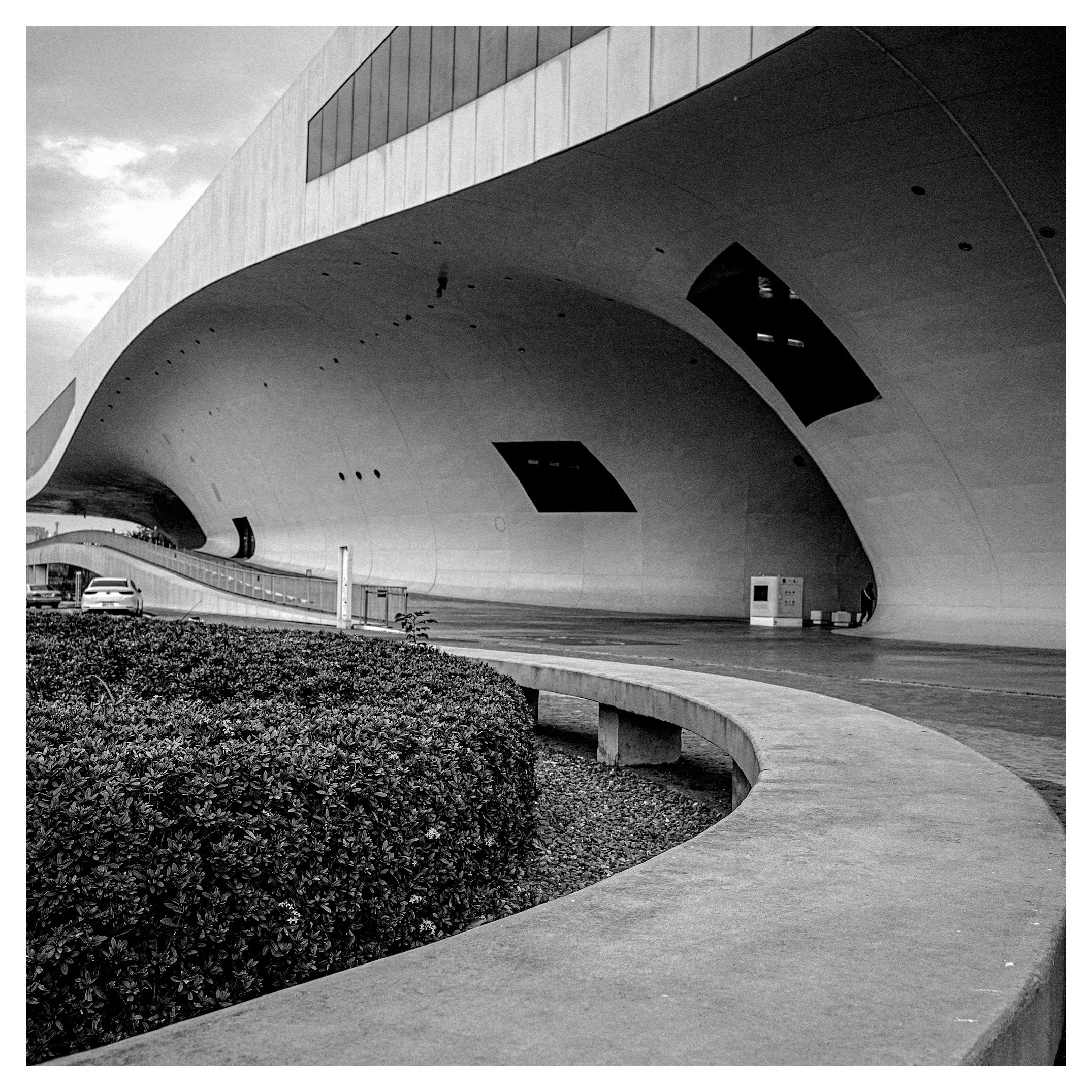
Camera Model: Ricoh GRIII
Shutter Speed: 1/800
Aperture: f/3.5
ISO: 200
The Critique: Symphony in Grey
You have captured a moment of profound architectural drama. This image—likely the National Kaohsiung Center for the Arts (Wei-Wu-Ying)—sings with the specific vocabulary of modernism: mass, void, and line.
What Works:
The sweeping curve of the roofline is the undisputed protagonist here. It acts as a massive, brooding wave crashing over the scene. The choice of black and white is excellent; it strips away the distraction of color and forces the viewer to focus entirely on the interplay of light and texture. The exposure is well-handled, maintaining detail in the bright concrete while allowing the deep recess of the tunnel to fall into a mysterious, inviting darkness. The Ricoh GRIII is famous for its high-contrast, gritty monochrome rendering, and you have utilized that strength well.
What Could Be Improved:
However, every image has a battle for the viewer’s eye, and here, you have a conflict.
• The Foreground Anchor: The large, dark hedge in the bottom left occupies nearly 25% of your frame. In photography, dark objects carry more "visual weight." This bush is so heavy it drags the eye down, fighting the upward, sweeping momentum of the architecture. A lower angle or moving closer to the concrete curve could have minimized this organic clutter.
• The Temporal Anchor: The white car in the background disrupts the timelessness of the scene. Without it, this image could be from 1970 or 2070. With it, it is merely a parking lot snapshot. In architectural fine art, we must be ruthless in excluding the mundane.
The Path Forward: The Archivist's Eye
You asked how to improve by compiling data. This is the secret weapon of the masters. You must move beyond simply taking photos to cataloging your vision.
Don't just store files; build a "Personal Retrospective Database." Create a spreadsheet (much like a library archive) where you track not just technical settings, but intent and outcome.
• Column A: Date/Location
• Column B: Emotional Keyword (e.g., "Alienation," "Flow," "Silence")
• Column C: The "Miss" (What went wrong? e.g., "Car in frame," "Too much foreground")
• Column D: The Rating (1-5)
Over a year, you will see patterns emerge. You might realize, "I consistently rate my images lower when I shoot at f/3.5 because I lose depth," or "I shoot my best work when I focus on 'Silence'." This data-driven approach turns photography from a lottery into a science.
Recommendations from the Library
To refine your eye for geometry and high-contrast composition, I recommend the following resources. These selections focus on the tension between light, shadow, and urban form.
1. Fan Ho: Portrait of Hong Kong
• Why: Fan Ho is the master of light and shadow in an Asian urban context. His work often uses large areas of darkness to frame a subject, similar to the tunnel effect in your image. Study how he balances the "heavy" parts of his frame with the light parts.
• Video: The Narrative Photography of Fan Ho
2. Henri Cartier-Bresson: The Decisive Moment
• Why: While known for street photography, Cartier-Bresson was a rigorous geometrician. He believed that the geometry of the background must be perfect before the subject enters. Your image has the geometry, but it lacks that "human spark" or perfect alignment that he mastered.
• Video: Henri Cartier-Bresson: The Decisive Moment
3. Michael Wolf: Tokyo Compression
• Why: Wolf’s work is about density and the crushing weight of the city. While your image is open, the "weight" of the concrete roof has a similar oppressive beauty. Wolf teaches us how to frame tight, cutting out the sky and ground to force the viewer into the texture of the city.
• Video: Michael Wolf on his Life and Work
Your Next Step: Return to this location. Eliminate the bush. Eliminate the car. Wait for a single human figure to walk into that patch of light near the tunnel entrance. That is your masterpiece waiting to happen.